개떡같이 말해도 claude.ai 가 이미지를 잘 만들었습니다. gemini는 너무 화려해서 마치 온라인 강의 혹은 책 표지처럼 만들어주네요.
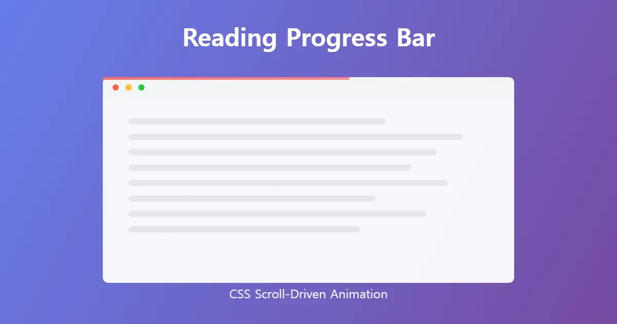
Reading progress bar는 현재 페이지의 진행 정도를 보여주는 바인데, PC에서는 항상 오른쪽에 스크롤바가 보이므로 큰 의미가 없지만, 모바일에서는 스크롤바가 사라지므로 상황에 따라 아주 좋은 기능이라 생각합니다.
파이어폭스는 animation-timeline: scroll(); 이 기능을 사용하기 위해서 따로 설정을 해야 합니다.
주소창 about:config 접속 후 layout.css.scroll-driven-animations.enabled 옵션을 true 로 변경합니다.
간단한 코드
css
.reading-bar {
  position: fixed;
  width: 100%;
  height: 5px;
  background-color: #AF3029;
  transform-origin: left;
  animation: fill linear;
  animation-timeline: scroll();
}

@keyframes fill {
  from { scale: 0 1; }
  to { scale: 1 1; }
}
조금 더 개선된 코드
페이지 첫 로딩 때 보이지 않게 하고, 클릭을 방지합니다.
css
.reading-bar {
  position: fixed;
  top: 0;
  left: 0;
  width: 100%;
  height: 5px;
  background-color: #AF3029;
  transform-origin: left;
  scale: 0 1;
  animation: fill linear;
  animation-timeline: scroll();
  z-index: 1000;
  pointer-events: none;
}

@keyframes fill {
  from { scale: 0 1; }
  to { scale: 1 1; }
}
위 코드가 전부입니다.
이제 reading-bar 를 전체 페이지에 적용하려면 main html, 개별 페이지에만 적용하려면 개별 html 파일의 적절한 곳에 넣기만 하면 됩니다.
아래 예시는 간단하게 메인 html의 body 첫 부분에 삽입합니다.
html
  ...
  </head>

  <body>
    <div class="reading-bar"></div>
    ...
  </body>
</html>
그런데 코드를 분리하는게 요즘 추세라네요?
그래서 css를 따로 분리하고, 개별 페이지 최상단에 넣어봤습니다.
ReadingProgressBar.astro
<div class="reading-bar"></div>

<style>
.reading-bar {
  position: fixed;
  top: 0;
  left: 0;
  width: 100%;
  height: 5px;
  background-color: var(--mark-text-color, #AF3029);
  transform-origin: left;
  scale: 0 1;
  animation: fill linear;
  animation-timeline: scroll();
  z-index: 1000;
  pointer-events: none;
}

@keyframes fill {
  from { scale: 0 1; }
  to { scale: 1 1; }
}
</style>
[...path].astro
import ReadingProgressBar from "components/features/ReadingProgressBar.astro";

<Html
  title={title}
  description={description}
  pubDate={pubDate}
  ogImage={ogImage}
  ogType="article"
  robots={draft ? "noindex" : undefined}
>
  <ReadingProgressBar/>
  <Nav />
  <main class="main-container">
    <article class="article-container">
      <div class="article-header">
...